5 free GitHub alternatives to paid software
Free open-source alternatives to ElevenLabs, Notion, Calendly, Semrush and Loom: VoiceStudio, AppFlowy, Cal.diy, OpenSEO and Cap, installed with Claude Code.
Read more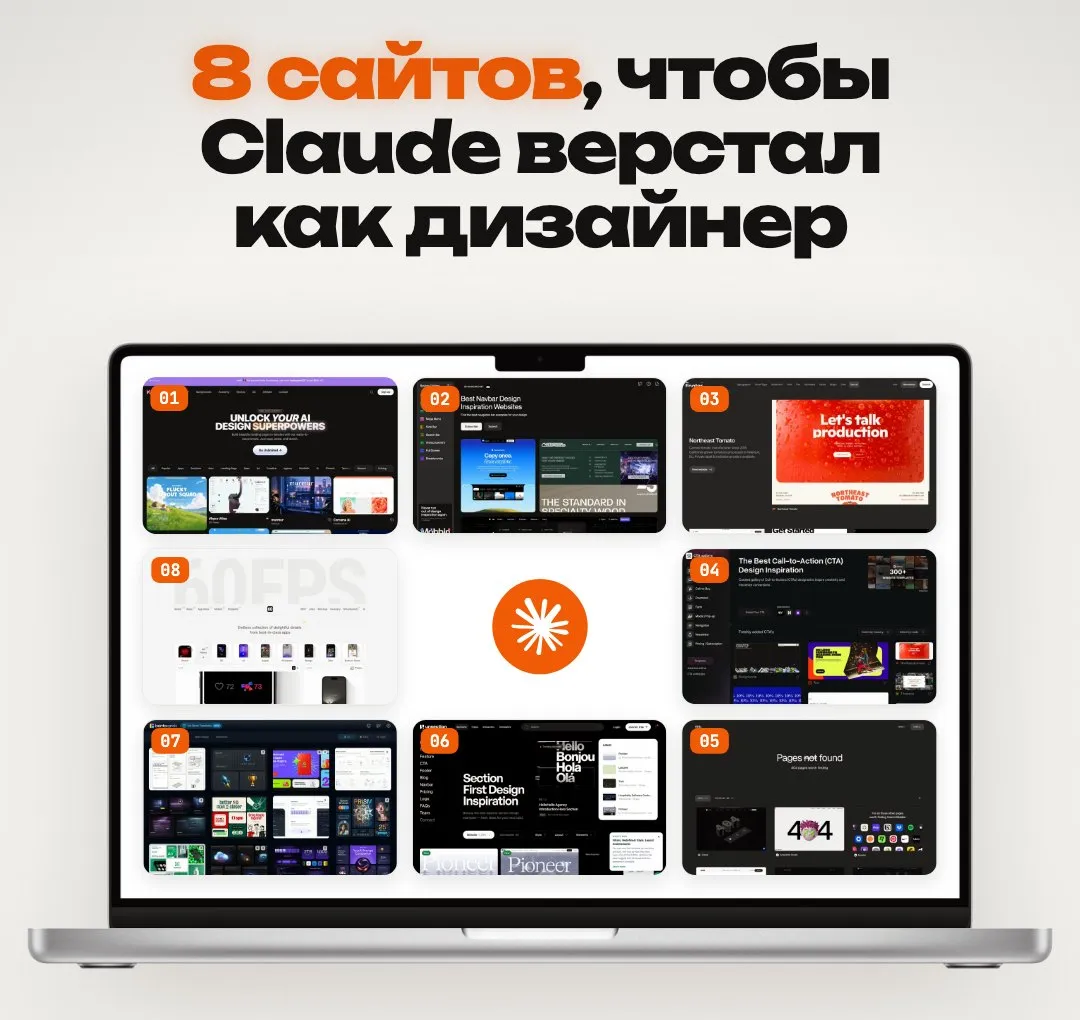
Claude writes decent layouts until you ask for something beautiful. Then you get the site everyone has: a gradient, three cards, a centred button. The easiest way to give it taste is a reference. A screenshot of one block plus a short prompt, and the result changes immediately.
Below are eight sites where I grab those screenshots, and the prompt I use to hand them over.
Claude reads “modern minimal design” the same way a million people before you did. So it gives you the average.
A screenshot is specific: how much space sits between blocks, how big the heading is, where the button lives, how the grid lines up. Things that take a paragraph to describe and a second to see.
Give it one block, not the whole page. A full page spreads its attention, and Claude starts averaging everything at once.
3D websites and the prompts behind them. Useful when the first screen needs depth and motion instead of a flat picture. Look at how the scene is built and how little text sits on top.
Navbars. Looks like a detail, but the header is on every page and sets the level right away. Easy to compare dozens of options: logo placement, number of menu items, the button on the right.
Footers. Usually done at the last minute, and it shows. Good for seeing how to split links into columns and where contacts go so the footer doesn’t look like a dump.
Buttons and call-to-action blocks. The exact spot where a site either sells or doesn’t. Watch the button size, the copy next to it and the empty space around it.
Error pages. A small thing that shows whether anyone thought the site through. Also a good example of how to make a joke without losing the visitor.
Ready-made sections: pricing, testimonials, FAQ, feature blocks. When you assemble a landing page from blocks, you’ll find a structure for almost any section here.
Bento grids, where cards of different sizes fit into one tile. Beautiful when the grid holds. Shows exactly how space is divided and where the main thing goes.
Micro-animations: taps, transitions, elements appearing. A screenshot won’t help here; describe what you saw to Claude in words or link to the specific example.
Some of these sites have a premium section, but browsing is free.
Take a screenshot of the block you need, attach it and write:
Build a [navbar / footer / pricing block] for a website about [topic].
Reference in the screenshot: take its structure, grid, spacing,
type hierarchy and animations, but don't copy the copy, logo or brand colours.
My colours: [...], font: [...]. Stack: [React + Tailwind].
First list what you're taking from the reference, then write the code.
What matters here:
A reference plus a short prompt beats any description in words. Save these eight sites and try them on your next block; the difference shows on the first attempt.
New lists appear first in the Telegram channel @vaykord_dev.
Free open-source alternatives to ElevenLabs, Notion, Calendly, Semrush and Loom: VoiceStudio, AppFlowy, Cal.diy, OpenSEO and Cap, installed with Claude Code.
Read moreCurated lists, breakdowns and building my products in public. No course ads.
Subscribe